
✨사진에 음영 추가하기✨
안녕하세요. 오늘은 사진에 세 가지 방법으로 사진을 꾸미는 법을 배워봅시다. 단색 음영, 줄무늬 음영, 점 모양 음영 추가하는 법 알려드릴게요. 포토샵이나 일러스트를 사용하지 않아도 HTML과 CSS만으로 작업 할거니까 Vscode에서 따라해주세요.
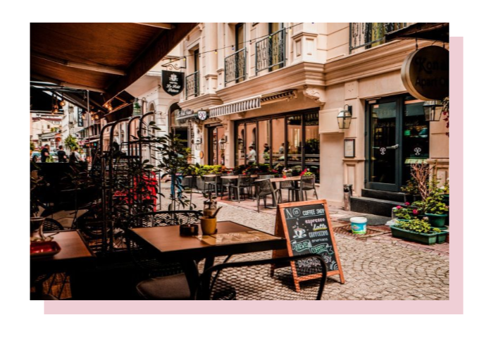
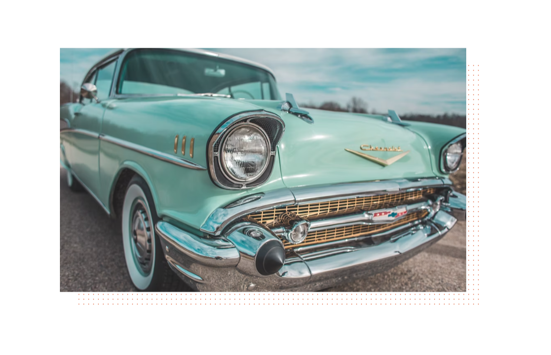
📌 STEP 1. 단색 음영 추가하기
<!DOCTYPE html>
<html lang="en">
<head>
    <meta charset="UTF-8">
    <meta name="viewport" content="width=device-width, initial-scale=1.0">
    <title>Document</title>
    <style>
        img {
            box-shadow: 20px 20px 0 #efcfd6;
        }
    </style>
</head>
<body>
    <img src="./Images/pic01.png" alt="">
</body>
</html>
☑️ HTML
<img src="이미지 경로"><img src="./Images/pic01.png" alt="">
☑️ CSS
img {
    box-shadow: offset-x offset-y blur-radius color;
}img {
box-shadow: 20px 20px 0 #efcfd6;
}
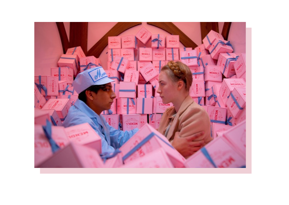
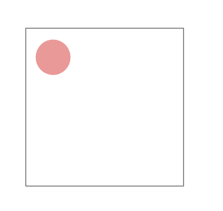
📌 STEP 2. 줄무늬 음영 배치하기
가상요소 선택자 ::before을 활용하면 자연스럽고 재미있는 느낌을 주는 대각선 줄무늬를 디자인할 수 있어요.
<!DOCTYPE html>
<html lang="en">
<head>
    <meta charset="UTF-8">
    <meta name="viewport" content="width=device-width, initial-scale=1.0">
    <title>Document</title>
    <style>
        .pic {
            position: absolute;
            top: 50%;
            left: 50%;
            transform: translate(-50%, -50%);
            display: flex;
            justify-content: center;
            align-items: center;
        }

        .pic img {
            position: relative;
            z-index: 2;
        }

        .pic::before {
            content: '';
            position: absolute;
            bottom: -15px;
            right: -15px;
            width: 100%;
            height: 100%;
            background-image: repeating-linear-gradient(
                -45deg,
                #818181 0px, #5a5250 3px,
                rgba(0 0 0 / 0) 0%, rgba(0 0 0 /0) 1%
            );
            z-index: 1;
        }
    </style>
</head>
<body>
    <div class="pic">
        <img src="Images/pic02.jpg" width="800" height="500">
    </div>
</body>
</html>
☑️ HTML
<div class="클래스명">
    <img src="이미지 경로" width="가로 길이" height="세로 높이">
</div><div class="pic">
<img src="Images/pic02.jpg" width="800" height="500">
</div>
☑️ CSS
.pic {
    position: absolute; /* 의사요소의 기준을 절대값(고정된 값)으로 설정 */
}

.pic img {
    position: relative;
    z-index: 2; /* 사진을 줄무늬 음영 위에 나오게 배치 */
}

.pic::before {
    content: '';
    position: absolute;
    bottom: -15px; /* 아래로 15px 이동 */
    right: -15px;  /* 오른쪽으로 15px 이동 */
    width: 100%;  /* 부모요소의 폭 100% */
    height: 100%; /* 부모요소의 높이 100% */
    background-image: repeating-linear-gradient(
        -45deg, /* 선을 -45도 회전 */
        #818181 0px, #5a5250 3px, /* 선의 색깔 */
        rgba(0 0 0 / 0) 0%, rgba(0 0 0 /0) 1% /* 선 사이에 있는 투명한 여백 부분 설정 */
    );
    z-index: 1; /* 선 음영을 사진 뒤쪽에 표시 */
}
의사요소를 사용할 때는, 먼저 위치 설정을 합니다. 고정된 값을 기준으로 요소를 배치하기 위해 부모요소인 pic의 position을 absolute로 설정해줍니다. 그리고 ::before은 자식요소가 됩니다. 이 before이 대각선이 되는 것이고 저는 오른쪽 아래로 15px만큼 이동시켜주었습니다. width: 100%, height: 100%를 설정해주면 부모요소의 크기(가로, 세로)를 그대로 물려받겠다는 뜻이 됩니다. 그래서 원본 이미지와 같은 사이즈의 그림자가 생기게 되는 것입니다.
가상요소가 어려우신 분들은 아래 포스팅 참조해 주세요.
[html/css] 가상요소 ::before, ::after 쉽게 이해하기
CSS 처음 배우시는 분들께 가상요소는 다소 어려운 개념입니다. 중급자들 과정에서 배우는 것이 적당하지만, CSS에서 자주 사용되는 트렌드이기 때문에 간단한 개념과 활용법 정도는 알아두시
awesomepossum.tistory.com
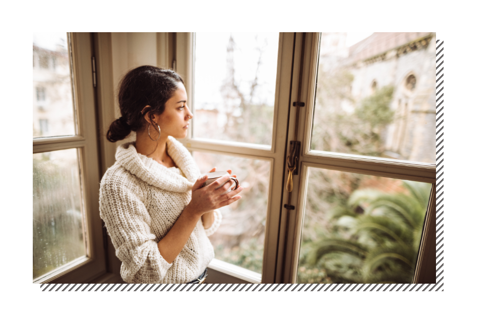
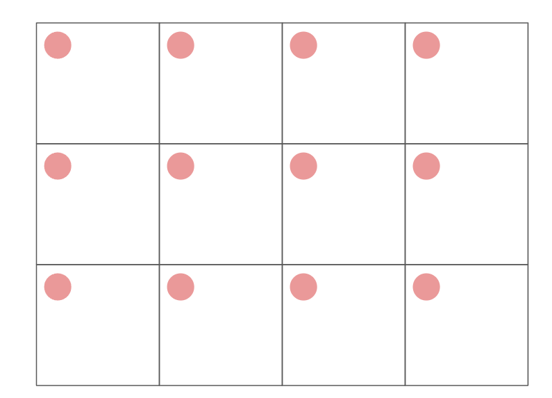
📌 STEP 3. 도트 음영 배치하기
귀엽고 아기자기한 느낌을 주는 점 음영이예요.
<!DOCTYPE html>
<html lang="en">
<head>
    <meta charset="UTF-8">
    <meta name="viewport" content="width=device-width, initial-scale=1.0">
    <title>Document</title>
    <style>
        .pic {
            position: absolute;
        }
        .pic img {
            position: relative;
            z-index: 2;
        }
        .pic::before {
            content:'';
            position: absolute;
            bottom: -30px;
            right: -30px;
            width: 100%;
            height: 100%;
            background-image: radial-gradient( /* 점의 색과 크기 지정 */
                #ea987e 20%,
                rgba(0 0 0 / 0) 21%
            );
            background-size: 10px 10px; /* background 크기 지정(점 사이의 여백) */
            background-position: right bottom; /* 점 무늬 시작 위치 */
            z-index: 1;
        }
    </style>
</head>
<body>
    <div class="pic">
        <img src="Images/pic10.png">
    </div>
</body>
</html>
css 속성에서 radial-gradient 속성을 설정해 주면 점 패턴지 반복되지 않을 때 점 하나와 여백의 크기가 결정됩니다.
이렇게 설정해준 한 칸이 계속 반복되어 점 무늬의 패턴을 형성하게 됩니다.
많은 도움이 되셨으면 댓글, 좋아요 눌러주세요.
궁금한 점이나 문의사항은 댓글로 남겨주세요.
'html&css' 카테고리의 다른 글
| [Logo Design] 사진에 로고 넣기, 글씨를 사진으로 채우기 (0) | 2024.04.07 |
|---|---|
| [Image Design] 사진에 필터 적용하기(대각선, 흐림, 회색조, 세피아) (1) | 2024.04.07 |
| [Image Design] 사진에 프레임 추가하기, 액자처럼 꾸미기 (0) | 2024.04.07 |
| [html/css] 가상요소 ::before, ::after 쉽게 이해하기 (1) | 2024.04.07 |
| [Image Design] 피사체에 그림자 배치하기 (0) | 2024.04.07 |